Color has a huge influence on how viewers perceive images. Interestingly, it mostly happens subconsciously. The average onlooker does not know why an image transmits a certain mood—it occurs without them knowing. As a photographer, it’s important you master the why so you can knowingly incorporate it into your creations. This week’s tip explains how color affects people in ways that communicate feelings or a frame of mind. Certain colors project impressions that lure onlookers in numerous ways. Begin to utilize color to magically influence those who study your photos.
It’s imperative to understand how color affects an onlooker. Imagine how futuristic and Jedi it could be to know you have “the force” to channel one’s thoughts and emotions when someone views your photos. Obtain an understanding to grasp how it influences the psyche. Strategically introduce color into your imagery to have it resonate with your audience in emotional ways.
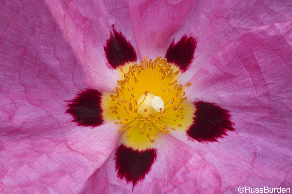
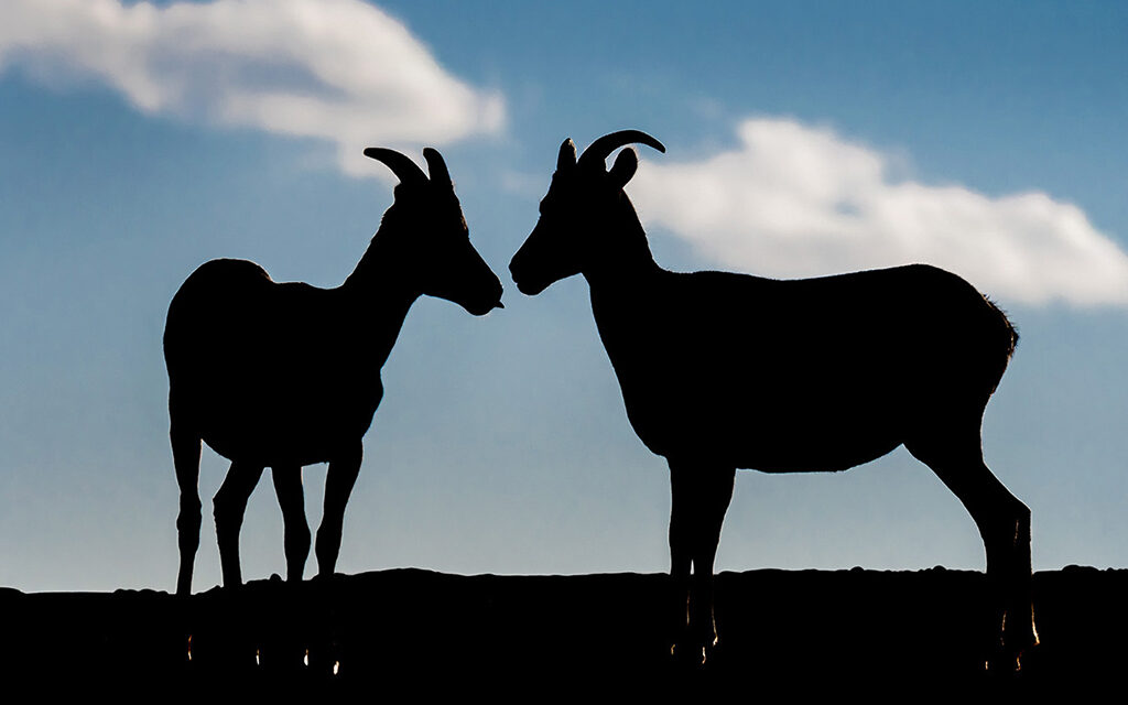
Multiple means can be employed to grab a beholder’s attention to immerse them in your images. One way is through saturated color. This doesn’t mean you go into Photoshop and simply move the Saturation slider to 100%. That will likely destroy any picture. I prefer to use Vibrance but do so sparingly. It’s more laid back but still allows the photo to “pop.” Another way is through the use of bold colors that stand out from the background. A basic example is a sole dandelion that grows in an all green patch of grass. A single bold color has power. Sometimes multiple bold colors work. Great examples are dramatic sunrises and sunsets. Colors that contrast are another good approach to arrest a beholder’s attention. Aspen leaves adorned in yellow vibrancy set against a mountain blue clear sky perfectly illustrates this.
Incorporate mood to lure people into your images. On a foggy monochromatic day, a cyclist dressed in bright red who rides up a mountain can be very striking. Use the subject of the isolated vibrant color as a primary focal point in the composition. It evokes a feeling of hope and positivity that the rider makes it. If that foggy condition is primarily blue in color, a melancholy overtone is unknowingly planted into the observer’s mind. A feeling of calm is analogous to blue hues.
In actuality, all colors project and represent precise feelings, emotions and thoughts. Colors are broken down into warm and cool tones. Warm tones such as yellow, red and orange provide the viewer with specific messages very different from photographs that are predominately green, blue and purple. Cool tones emit feelings of tranquility and calmness while warm tones run the gamut from anger to warmth to love. What continent you reside in determines a given color’s connotation because various cultures have different meanings for different colors.
The following list summarizes how given colors impact those in the Western world:
Black: Power / Strength / Stability / Grief. When related to clothing, black is associated with power. The CEO of the company wears a black suit or black dress. It has a “slimming” effect. Graduation gowns are often black. Grief is associated with black mourning garments. Villains often wear black. It’s also stylish and timeless. Black can also imply submission. Priests wear black to show submission to God.

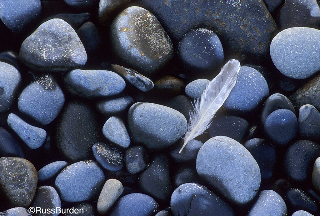
White: Purity / Cleanliness / Innocence. White is the color of innocence. A bride wears white, when a baby is baptized it’s in a white suit and a white picket fence symbolizes a happy home. Pure thoughts are associated with white. It’s popular in decorating because it goes with everything. Doctors and nurses wear white coats to imply sterility.
Yellow: Happiness / Optimism / Cheer / Rebirth. In spring and summer, yellow flowers bring new life and warmth. It’s an attention-getter. Traffic signs such as YIELD are bright yellow and traffic lights use yellow to signal caution. Yellow is often used in advertisements as an attention-getter. It spurs creative thoughts and brings promise. It’s synonymous with the sun and suggests happiness, warmth and laughter.
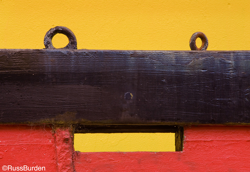
Red: Notice Me / Speed / Anger / Love. Red provides a plethora of symbolism. Red roses and hearts are associated with Valentine’s Day. Speed is associated with red cars. More speeding tickets are issued to drivers of red cars. Because it triggers endorphins in the brain, anger and rage are represented by red. Red subjects are high on the list of most photographers. It commands attention. Stop signs are red. Their shape, color and message are universal regardless of the language. When red appears in a photo, it’s hard to overlook.
Orange: Fun / Energy. It connotes a feeling of change—think fall color. If it leans more toward reddish hues, it creates excitement. If more yellow, it favors tranquility. Orange is vibrant, so traffic cones are this color, road workers wear orange vests to be noticed and prison outfits are orange. Orange tends to stimulate activity and appetite.
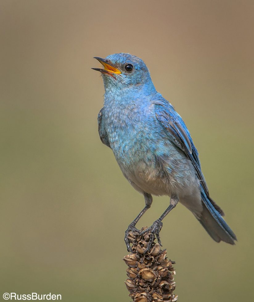
Blue: Calm / Tranquility. When blue is viewed, the body releases hormones that produce a calming effect. It’s a trustworthy color. A clear blue sky is calming and provides relaxation. The ocean has the same effect. It’s often used in bedrooms. Job recruiters recommend wearing blue suits to interviews as it shows loyalty. On the other hand, it can be cold and depressing. Think about having “the blues.” An entire genre of music is devoted to it.
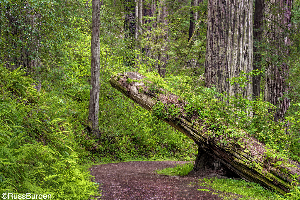
Green: Nature / Growth / Harmony. It’s the predominant color in the natural world, so it has a refreshing quality. It’s soothing and provides tranquility. When people wait to appear on TV, they go to the Green Room. Hospitals use green because it relaxes patients. Fresh and lush veggies are green. We associate green with spring and new growth.
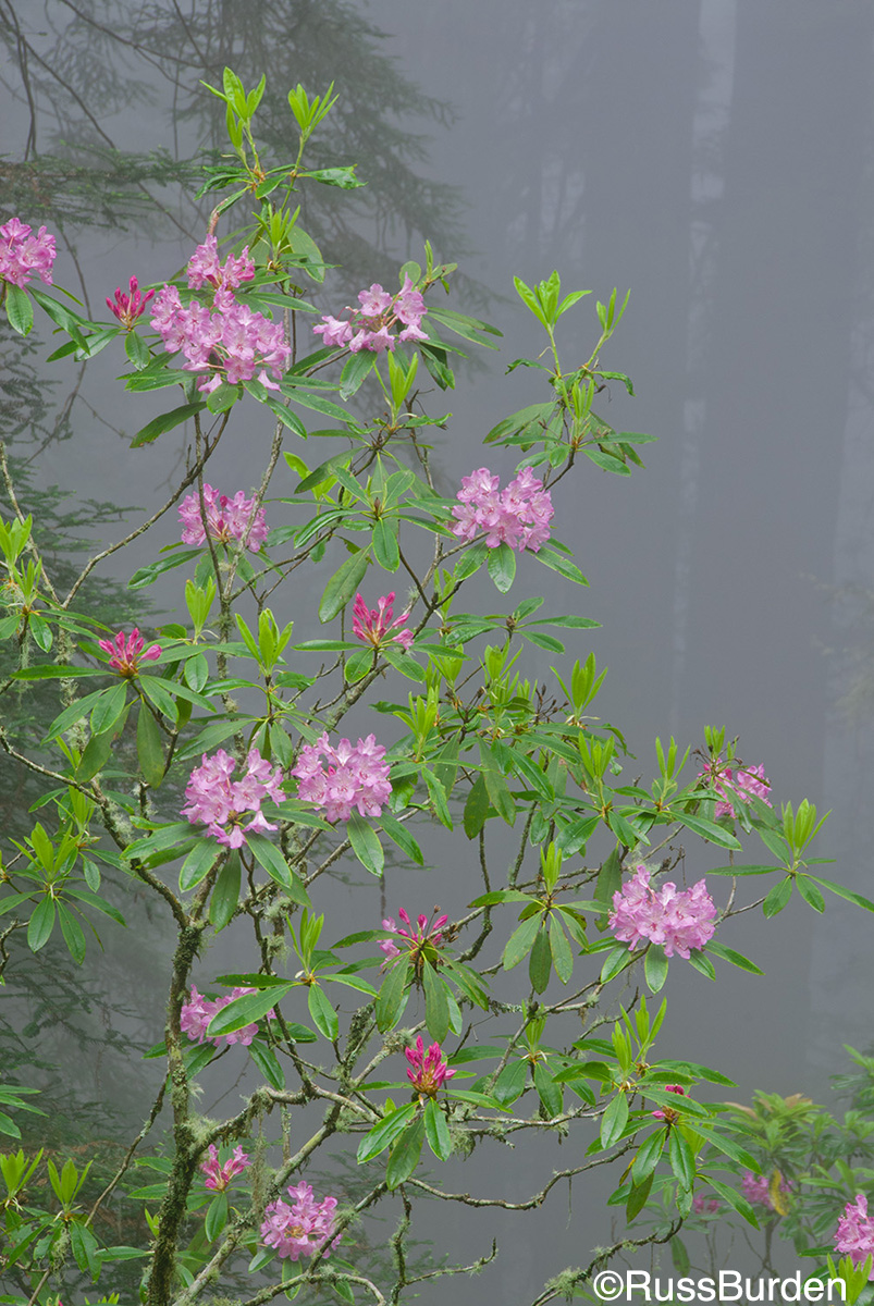
Purple: Royalty / Wealth. Purple is the color of kings and queens, so it’s associated with luxury, royalty and wealth. Royal robes were purple. Sophistication is a characteristic of purple. Purple can be both uplifting and calming. It depends on the vibrancy and hue. It is also feminine and romantic. It’s not often associated with nature as most purple items are man-made.
Now that you’re armed with the above information, I feel obligated to impart a warning of great magnitude. A warning that’s so huge, I request you read this paragraph again before you try out the aspects of this week’s tip. It’s Imperative to understand color and I encourage you to use it strategically, but don’t include bold color just because you can. Use the information in this week’s tip to realize how and why you use it to your advantage. Don’t incorporate color just because it’s there. Exploit the psychological aspects I presented to include strong color purposefully, not because strong color is seen through your lens. Please heed this warning!
If you want to probe more deeply into this topic, study advertisements and commercials to see how creators use color to lure potential buyers. You’ll more thoroughly understand how it is used to influence shoppers to try their product. I leave you with one more thought—I came across a great word a number of years ago: chromotherapy. I found it intriguing and did a bunch of research. I encourage you to explore it. You can start by using the above search field above and insert the word. I wrote a Tip of The Week that relates to it.
Feel free to explore more of my photography at my website: www.russburdenphotography.com or visit my SmugMug page: https://russburden.smugmug.com.
The post The Impact Of Color In Photography appeared first on Outdoor Photographer.