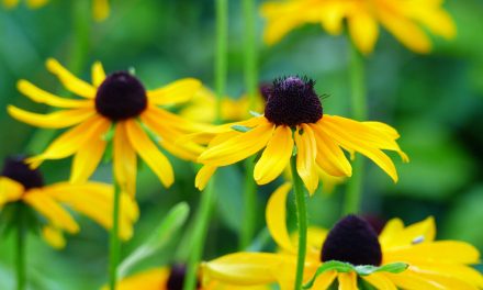
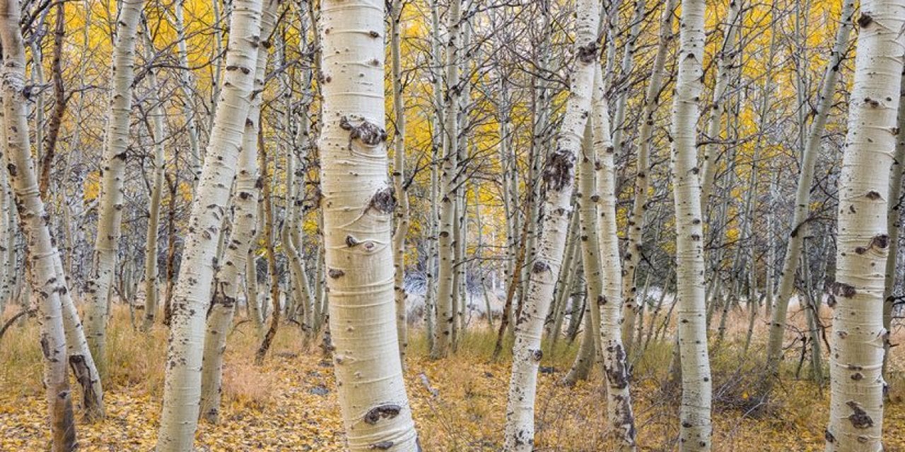
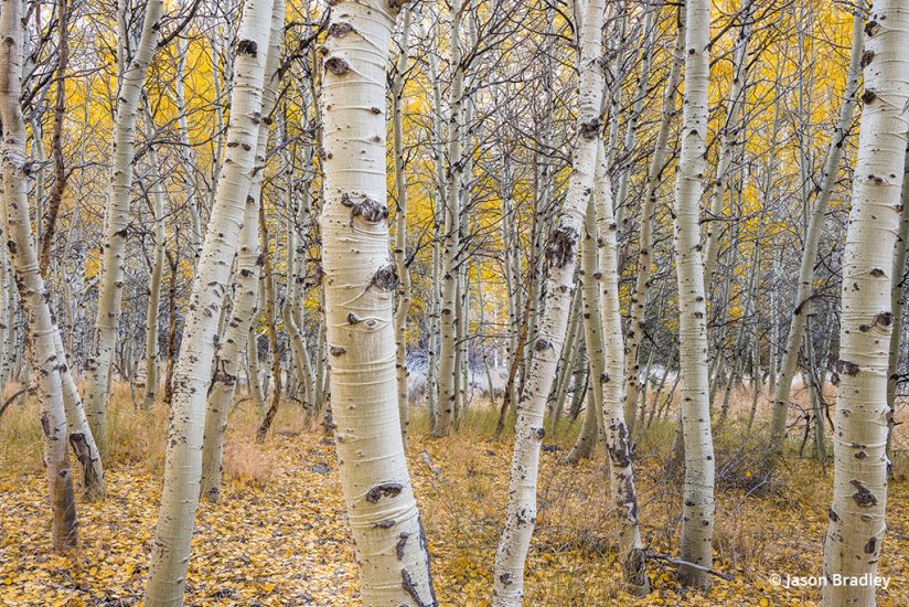
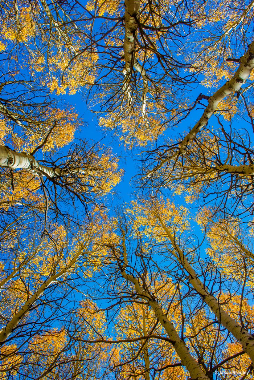
Fall is here, and that means that a variety of opportunities to photograph bright, colorful landscapes, vibrant close-ups and an assortment of saturated eye candy await. For many nature photographers, fall is the best time of year to explore color photography, but color does have its challenges. Processing fall color photos to bring out the natural beauty of the scene—without overdoing it—is one of those challenges.
Mastering the subtleties of color takes time and study. Color photography is more complex than one might think, and to become well-versed in its practice, you need an understanding of color theory and color psychology. You have to become familiar with terms such as complementary, split complementary, analogous, triadic, dyadic and monochromatic. Moreover, color is seductive and thus often overdone in post processing. We nature photographers want to turn that color “up to 11” and push those colors sliders all the way to Disneyland. I, too, am guilty of this from time to time.
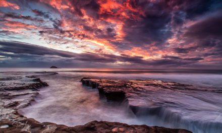
Figure 2 below illustrates a prime example of what I humbly think is a tad much. But how do we know when to hold back? How do we know when too much is too much? In short, there is no easy answer to this. You are, of course, always welcome to send me and my print lab your files to see if we respond with an alarm or fog horn of some kind, but playing, and playing more still with your images in Lightroom or your preferred editing program, is the best way to begin getting a feel for when you may have gone over the edge.
Processing Fall Color Photos: Saturation Versus Vibrance
All things considered, I do have one important Lightroom tip to share. And it’s all about getting a deeper understanding of the distinction between how the Saturation and the Vibrance sliders work.
In a nutshell, Vibrance is a smarter slider than Saturation. Don’t worry, Saturation fans; I’m not suggesting Saturation is by any means dumb. However, Vibrance does a thing or two that the Saturation slider does not.
For starters, Vibrance is a nonlinear approach to color amplification while the Saturation slider is not. Meaning, when increasing Vibrance (moving the slider to the right), the colors that are more muted in your frame become more vibrant, while the colors that are less muted saturate at a different rate. So not all the colors are affected in the same way. Saturation, on the other hand, will increase all the colors present regardless of whether they are muted or not. And though not likely a concern when processing fall color photos, it’s also good to know that Vibrance, when increased, tries to preserve skin tones.
What this means is that the Vibrance slider is the tool to use if your goal is more color variety throughout your image. Thus, I wouldn’t suggest you begin playing with most of your fall color images using the Saturation slider. There’s likely already a strong mix of colors in your frame, and using the Saturation slider could push the colors that are already saturated too far. In fact, my typical workflow with such images is to increase the amount of Vibrance first, to get the mix of colors where I want them, which tends to make things look uber-Disney, then back off the color with the Saturation slider. Decreasing Saturation may seem a little backwards at first, but it works wonders if you use Saturation in conjunction with the Vibrance slider in this way.
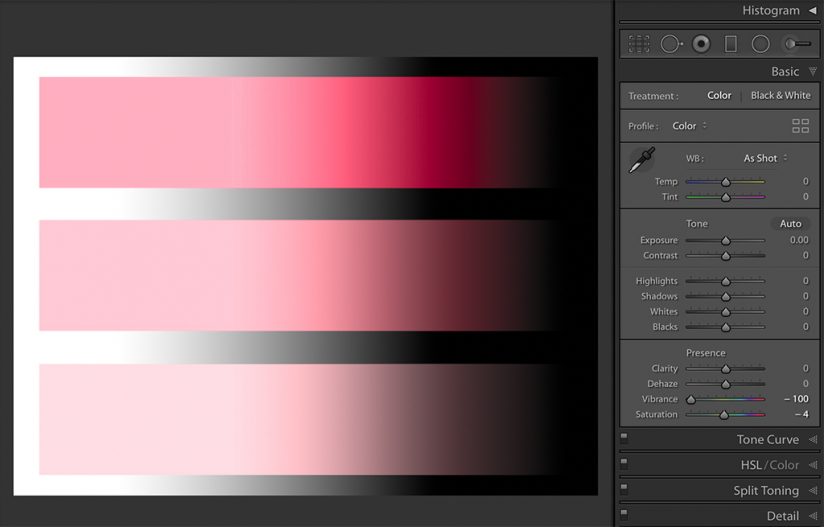
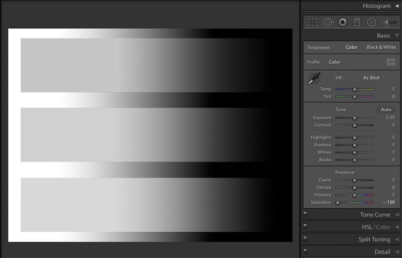
The difference between these two sliders and their linear/nonlinear traits becomes quickly evident when they are both decreased (slider moved to the left). In Figure 3a and 3b, we see a pair of images. The one on the top illustrates that when the Vibrance slider is moved all the way to the left, some of the color is preserved. The image on the bottom shows that when the Saturation slider is moved, nothing is preserved, and all color—regardless of hue or intensity—is removed, leaving a black and white image.
Know this as you frolic through the foliage this fall: Color is most impactful in a photo if it’s believable, if it’s true to life and not overdone. I’m not saying the color needs to be exactly what you saw. Heavens no. I encourage you to interpret color however you like based on what you experienced as much as what you saw. But just because you want to show a vibrant, colorful scene doesn’t mean you should necessarily only spotlight the color either. Consider color as if it were one musical note among many that are required to construct a chord. When constructing a landscape outdoors, color isn’t your only consideration. You are also looking at pattern, texture, shape, movement, light, shadow and mood. Everything needs to fit together, harmonize and balance.
The next time you’re tempted to push those sliders all the way to Disneyland, remember that’s not all that’s in your frame. Start with Vibrance, create more color variety, and then try backing off your color by moving that Saturation slider to the left. Your colors will be left with more subtlety and nuance, paving the way for the other elements of your composition to receive the attention they deserve.
The post Processing Fall Color Photos In Lightroom Classic CC appeared first on Outdoor Photographer.