As photographers, we rely so much on our eyes that it’s almost second nature to decide whether a picture is too bright, too dark or just right simply by the way the LCD preview image looks. But from leading photo workshops for more than a dozen years, I’ve learned that the single biggest cause of exposure mistakes is making decisions based on the way the picture looks on the camera’s LCD.
The image preview your camera displays is great for checking composition, but the brightness of the image varies both with the LCD’s brightness setting and with the always-changing ambient light. Compounding the problem, the picture you see is a JPEG that doesn’t display the full range of tones captured. A much more reliable way to determine exposure is to use the histogram your camera creates with every click.
Histograms Explained
A histogram is a graph of the tones in an image. Its simplest form, the monochrome version virtually all digital cameras display, is the luminance (or luminosity) histogram. Understanding the luminance histogram will improve your photography and make reading the (slightly) more complex RGB (red, green, blue) histogram much easier.
For some, any graph has the potential to evoke flashbacks to the trauma of high school science class. But a histogram is quite simple—simple enough to be interpreted in the blink of an eye.
When an image is captured by a digital sensor, your camera’s processor creates a JPEG preview image for display on the camera’s LCD. As it creates the preview, the camera samples the brightness of each photosite and assigns it a tone (brightness) value ranging from 0 (absolute black) to 255 (absolute white). Every tone value from 1 through 254 contains detail—the higher the number, the brighter the tone.
Armed with the tone values for each photosite, the camera builds the image’s histogram. The horizontal (X) axis of the histogram has 256 discrete columns (0-255), one for each possible brightness value, with the 0/black column on the far left and the 255/white column on the far right. (They don’t display as discrete columns because they’re crammed so close together.)
Your camera builds a new histogram for each image, adding each photosite’s brightness value to its corresponding column on the histogram, like stacking poker chips. The more photosites of a particular brightness value, the higher its corresponding column will spike.
Reading A Histogram
Not only does the range of tones visible in the LCD preview vary with ambient light and screen brightness, even in ideal conditions, more information is captured by the sensor than the LCD preview can show. And though the camera uses the same preview JPEG to build its histogram, the histogram provides a more consistent, precise source of exposure information that can be relied on regardless of external factors.
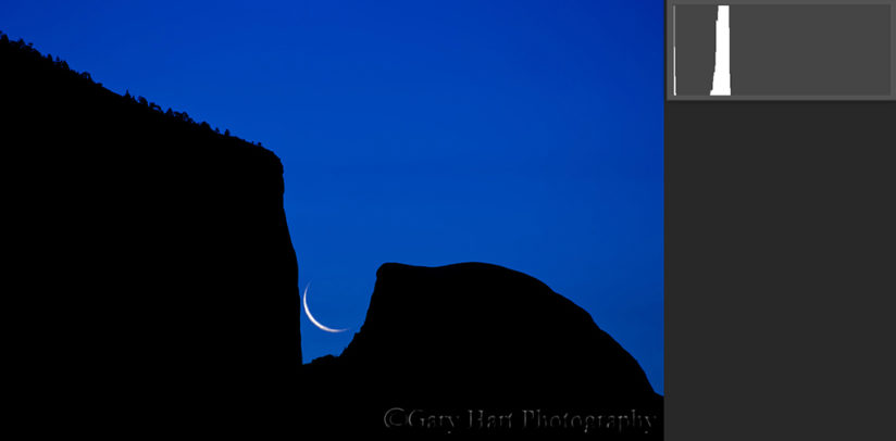
There’s no such thing as a “perfect” histogram shape. The histogram’s shape is determined by the distribution of light in the scene, while the histogram’s left/right position is a function of the amount of exposure given the image. The histogram’s height is irrelevant—information that appears cut off at the top of the histogram just means the display isn’t tall enough to fit all the photosites possessing that tone.
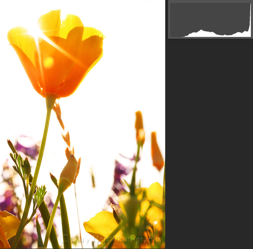
The amount of exposure you give an image is a creative choice, but as a general rule photographers try to avoid clipping (cutting off) the histogram’s graph on the left and right. A histogram clipped on the left means some of the scene’s detail is pure black; a histogram clipped on the right means some of the scene’s highlight detail is pure white.
Managing A Histogram
In a perfect world, when you see your histogram clipped on the left, you simply increase the exposure to shift the histogram right (brighter) until no shadow data is clipped. And if you see your histogram is clipped on the right, you decrease the exposure to shift the histogram left (darker) until no highlight detail is clipped. Problem solved.
Many scenes contain too broad a range of light, from the darkest shadows to the brightest highlights, for the camera’s sensor to record. In these scenes, you can blend multiple exposures that cover the entire range of tones or apply a graduated neutral density filter to darken the brightest areas of the scene.
When blending exposures or using GND filters isn’t practical or available, I usually underexpose to sacrifice (clip) the shadows and save the highlights. Not only are clipped shadows easier to recover in processing (albeit with some noise) than clipped highlights, but also the human eye is generally drawn to the brightest things in an image, so lost highlight detail is much more damaging to an image.
When metering high-dynamic-range scenes, remember that the histogram is built from the preview JPEG, so a RAW image actually contains more image data than the histogram shows. Because the amount of recoverable RAW detail varies with the camera, it’s important to know how much you can clip your camera’s shadows and highlights and recover them later. On the other hand, JPEG shooters have a much smaller margin of error and need to be more conservative with their clipped shadows and highlights.
While the general goal is to ensure that none of the tone data is cut off on the left or right side of the histogram, the exposure you choose for a scene is ultimately a creative choice. Though I often expose my scenes to match the amount of light my eyes see, sometimes I decide to make the scene darker or brighter than what I see.
Experienced photographers who are comfortable reading and managing a histogram will often expose their images so the histogram is as far as possible to the right without clipping, then reduce the brightness later in Lightroom or Photoshop. This “expose to the right” technique is a valid approach that yields more image data and less noise, but it must be done with care because the margin of error is much smaller on the highlights side of the histogram—even a small misjudgment can result in unrecoverable highlights and a ruined image.
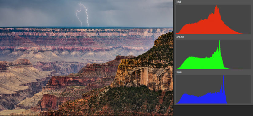
The RGB Histogram
While the luminance histogram tells you about the detail you captured, the RGB (red, green, blue) histogram shows the color you captured.
To capture color, each photosite on a digital sensor measures the intensity of the light in one of three colors: red, green and blue. The camera uses this color information, and the color information from adjacent photosites, to interpolate the actual color for that location on the sensor. It also uses the color brightness to assemble individual red, green and blue histograms. Combined, they form the RGB histogram, displayed as three separate graphs or all three colors overlaid on a single graph.
If you’ve ever wondered why a sunset or blue sky appears washed out when the luminance histogram looked fine, the answer is probably in the RGB histogram. Even when one or two color channels are clipped, the luminance histogram can still look fine, creating a false sense of security. Photographers who use the “expose to the right” technique and rely on the luminance histogram without checking the RGB histogram are especially at risk of clipping colors.
Most scenes have a fairly even color distribution (all three channels have a similar histogram), but if you’re photographing a scene with one vivid color, such as a sunset or a backlit flower, you may find one color channel skewed far to the right. Even if just one channel is clipped, the only solution is to adjust the exposure for the entire scene.
A Picture Is Worth A Thousand Words
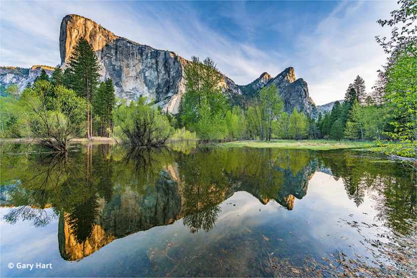
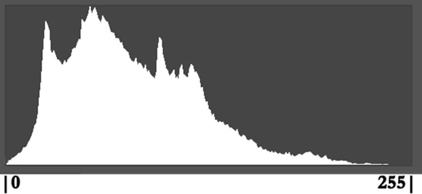
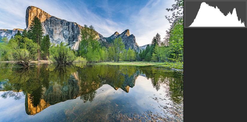
The two Horseshoe Bend sunstar images here are from the same file. The first is the way the image looked on my camera’s LCD, along with its histogram; the second image is the same picture after just a few minutes of adjusting highlights, shadows and curves in Lightroom and Photoshop—no plugins, blending or other elaborate processing.
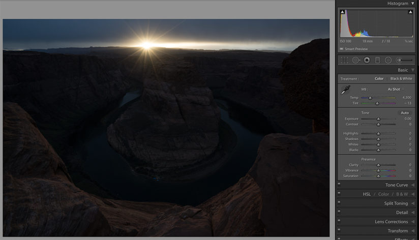
If I had given the exposure enough light for the shadows to look good (closer to how my eyes saw them) on my LCD, the highlights would have been hopelessly overexposed. Similarly, if I had darkened my highlights enough to look good on my LCD, the shadows would have darkened to an unrecoverable and/or noisy black. I knew my best chance for capturing this high-dynamic-range scene with a single click was to ignore my LCD preview and trust the histogram.
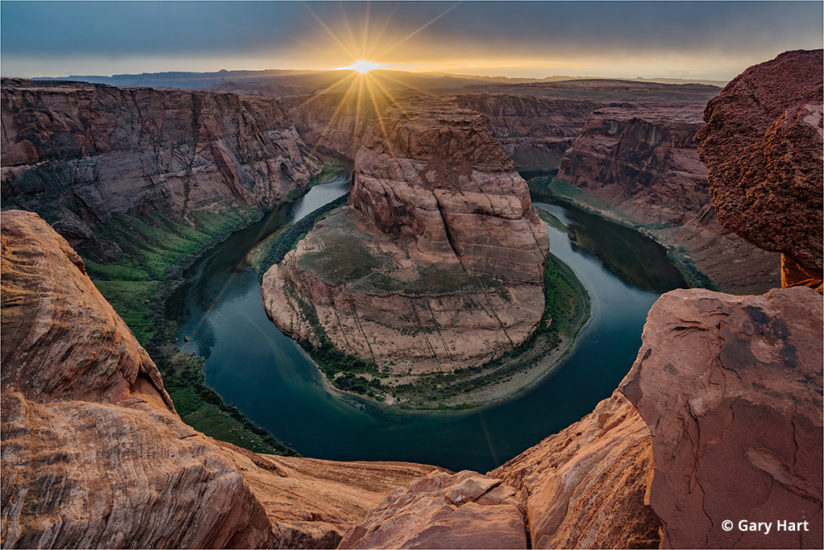
Despite an image that didn’t look good at all on my LCD, the histogram on my Sony a7R II showed me that I’d captured virtually all of the scene’s shadows and highlights. And because I captured this image in RAW mode, careful positioning of the histogram kept both shadow and highlight clipping minimal and in the recoverable range. Ignoring my preview and trusting my histogram allowed me to achieve the final image you see here with very little processing.
YOU MIGHT ALSO LIKE
RAW Photo Workflow In Lightroom
A guide to processing for creative expression in the age of Photoshop. Read now.
The post How To Use Histograms appeared first on Outdoor Photographer.