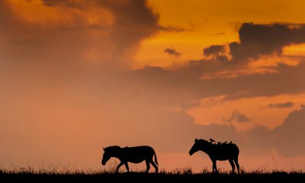
The term Chiaroscuro (pronounced kee-AR-ə-SKYUR-oh) has been around since the Renaissance. Primarily used in paintings and woodcuts, it evolved into the photographic world. It comes from the Italian for light/dark. It relates to how contrasts of bright highlights and heavy dark shadows intermingle and share edges. Mostly reserved for very strong contrasts, it also relates to the play of dark upon light or vice-versa to create three-dimensionality on two-dimensional surfaces. Photographically, it applies to landscapes, portraiture, black and white, interiors, architecture, motion pictures, etc. Study the low light scenes in cinematography, especially some of the old classics, and it abounds.
The origins of chiaroscuro in photography developed with portraiture. It’s most commonly associated with Rembrandt lighting made famous by the painter of the same name. Because it migrated into other media mentioned above, Chiaroscuro in photography isn’t solely relegated to Rembrandt lighting. In studio work, it’s based on the placement and intensity of each artificial source. In nature, the photographer is much more limited as light is dictated by the elements and landforms. To achieve the look, the overarching key is for shadows and highlights to play upon each other to add depth, dimensionality, drama and impact.
Leonardo DaVinci is credited with popularizing the effect. For a painting on which he was working, he needed a way to emphasize depth with low-key lighting. He devised a technique to show gradations of shadow and light to make the observer visualize layers of planes on a single-plane canvas. The concept was born. Today, the effect is primarily used for portraiture. Most often, window light is utilized to obtain the look. It is essential the only source of illumination emanates through the window as it spotlights the primary subject.
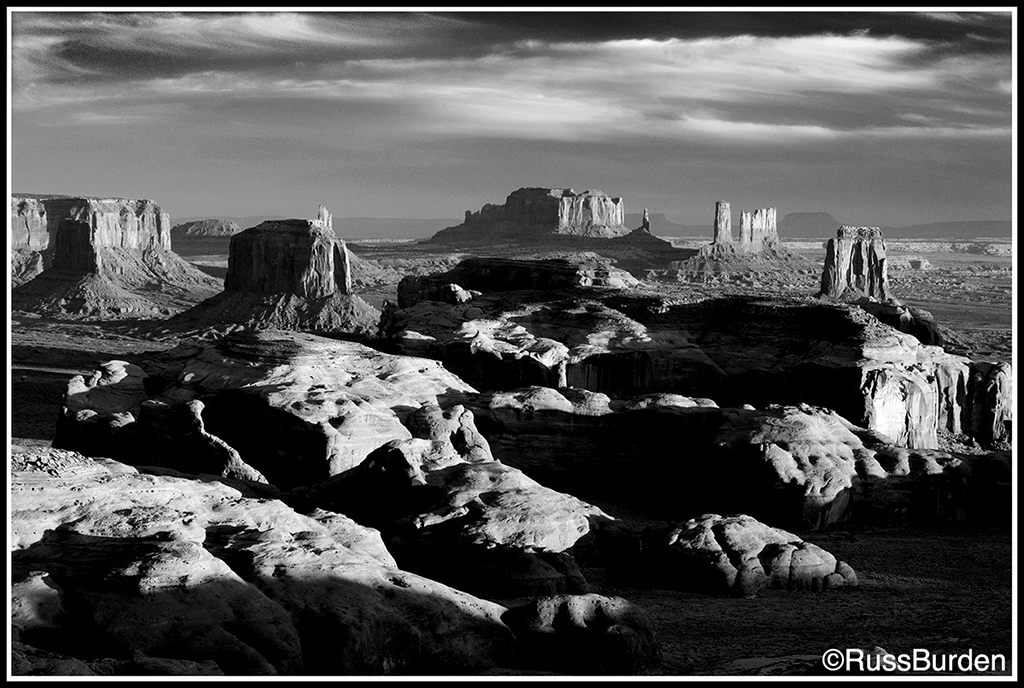
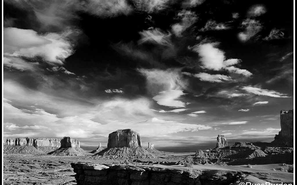
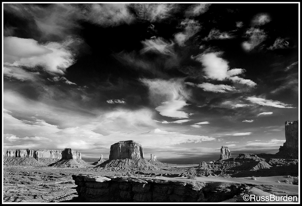
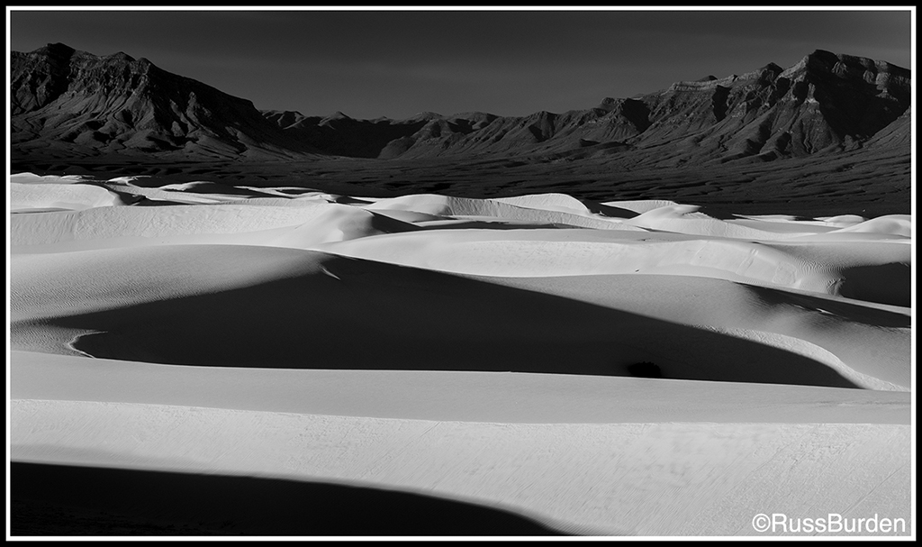
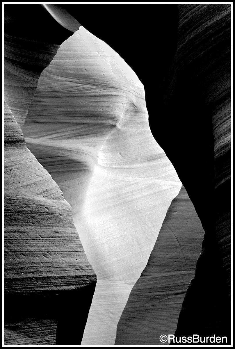
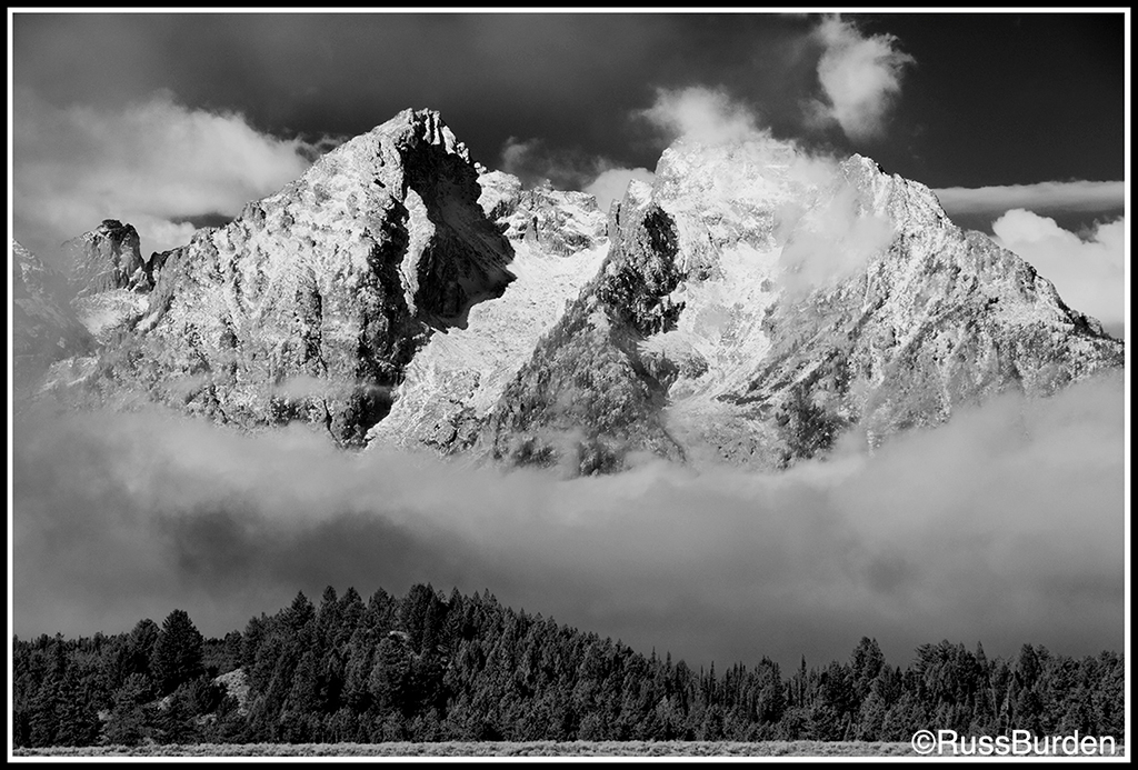
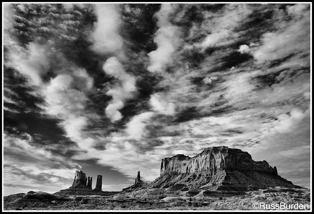
For chiaroscuro, I gravitate toward black and white because the effect is more easily enhanced in post-processing compared to color. Black and white and chiaroscuro are a great match. One characteristic of a great black-and-white landscape is it displays a wide tonal range. The more that pure white butts up to pure black, the stronger the chiaroscuro. With regards to the meaning of the word, if the subject matter is reduced to just light and dark, what better medium than Black and white to depict it?
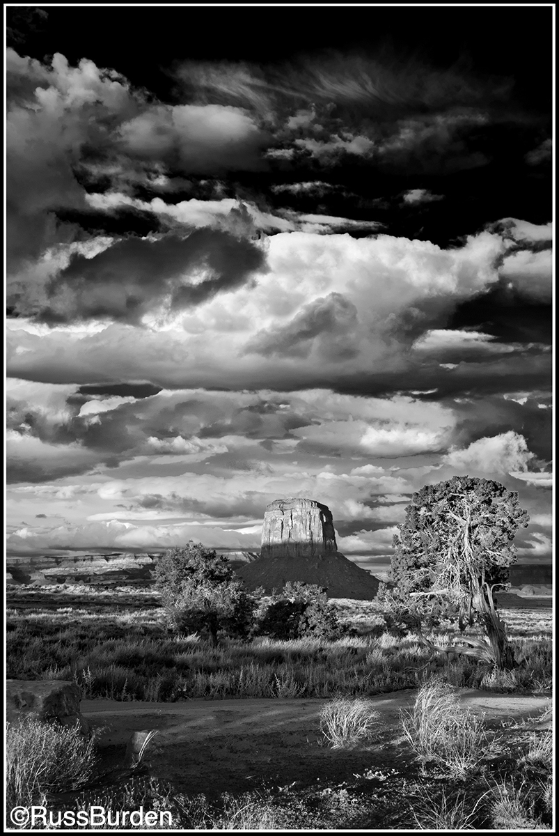
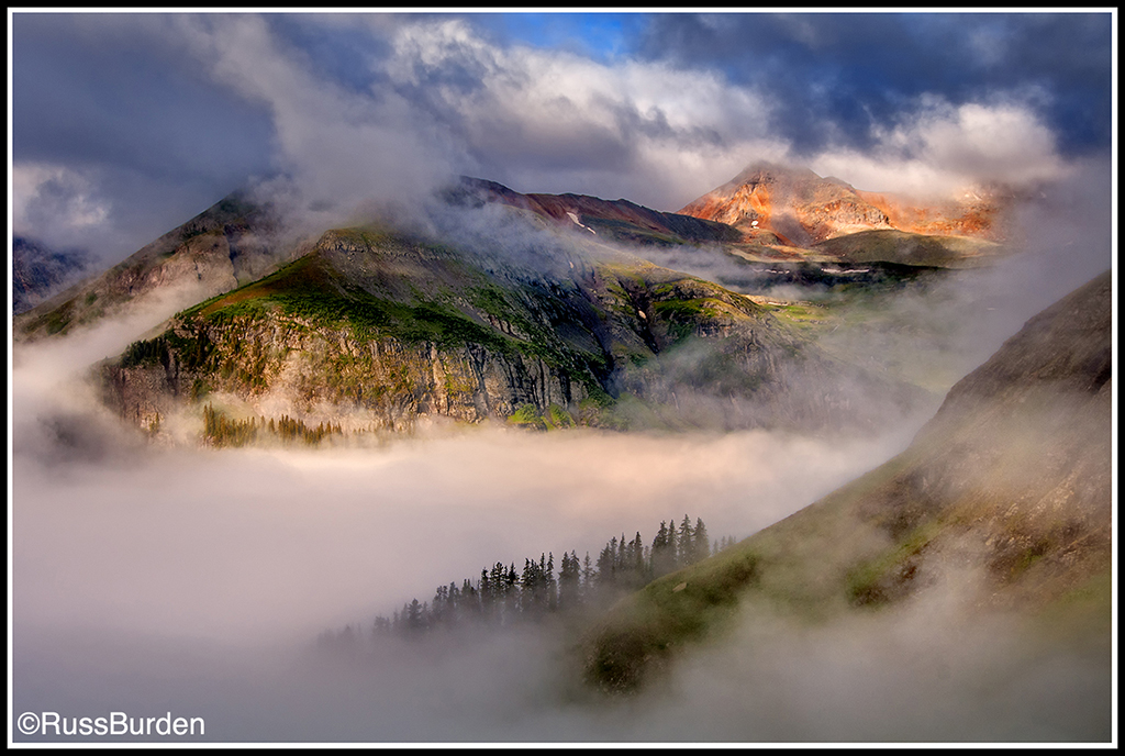
Successful landscapes are often determined by how the sun channels its light around clouds and onto the land. This is exponentially truer if the goal is to capture chiaroscuro. Clouds play an integral role. Icing on the cake is provided by ground-level atmospherics that further direct and narrow the angle of light and how shadows interact with the placement of that light. See the photos I chose to illustrate this week’s tip. All are black and white except one. It just so happened on the morning I made the color image in the Colorado high country, the elements, ground fog, clouds, the funneled light from the sun and the position of the mountains fell into alignment. It was absolute serendipity and I included it in this week’s tip to validate that color can be used to depict the effect.
Although Chiaroscuro can be specifically described and defined, it’s not easy to incorporate the art form into nature photography. Just because a photo contains a lot of darks and highlights doesn’t substantiate it epitomizes the style. Studio photographers have 100 percent control of the light and can totally replicate what the Renaissance artists produced centuries ago. Powerful flash units in conjunction with gobos, barn doors, gels, painted backdrops and more allow product photographers to plug subjects into setups specifically built for the effect. Portrait photographers have the same benefit. Today’s painters can mirror what the originators created. But nature photographers rarely encounter lighting situations that mimic chiaroscuro. It’s a matter of chance that puts us in the right place at the right time for moments that may last but a few seconds.
It’s virtually impossible for nature photographers to head outdoors and make the claim that today they’ll make nothing but chiaroscuro images. If you’ve read this far, you’re now aware that natural light of this kind isn’t often encountered. If you happen upon it, take full advantage. Again, it’s not just highlights and shadows that provide the effect. The light has to provide that extra “something” that depicts depth, dimensionality, drama, intrigue and contrast. This is one of the main reasons black and white is a great medium to show it off. In post-processing, software can be used to strongly darken the blues of the sky while simultaneously punching up whites in the clouds. This helps push the effect of a third dimension in the sky. Specific dark areas can be further enhanced through “burning” in those sections—an old darkroom effect that has been around a long time. I learned it while taking college courses back in the day. At the same time, lighter areas can be made even lighter by “dodging” them—again, an old darkroom trick.
Scan through your files to see if you have any potential RAW files that can be worked to bring out potential chiaroscuro. If you find none, keep a picture in your head of what ideally portrays the look and if you encounter it, rack up those pixels.
Feel free to explore more of my photography at my website: www.russburdenphotography.com or visit my SmugMug page: russburden.smugmug.com.
The post Chiaroscuro: Light That Portrays Contrast And Drama appeared first on Outdoor Photographer.