The colors that are included in a given composition are important to the emotional response an image receives. While it’s impossible to dictate color in your subjects, it’s not impossible to dictate what you include in your viewfinder that determines where colors fall and how they work either in conjunction with or in opposition to each other. (More about this can be found below in the section on the Color Wheel.) Learn to incorporate color to make it look as if it was created with intention rather than happenstance. Warm tones affect a viewer differently than cool tones. Saturated color versus muted color provides different emotional feelings. The more cognizant you are of the colors you include or how they play off each other, the more deliberately you can affect the way the viewer perceives your images.
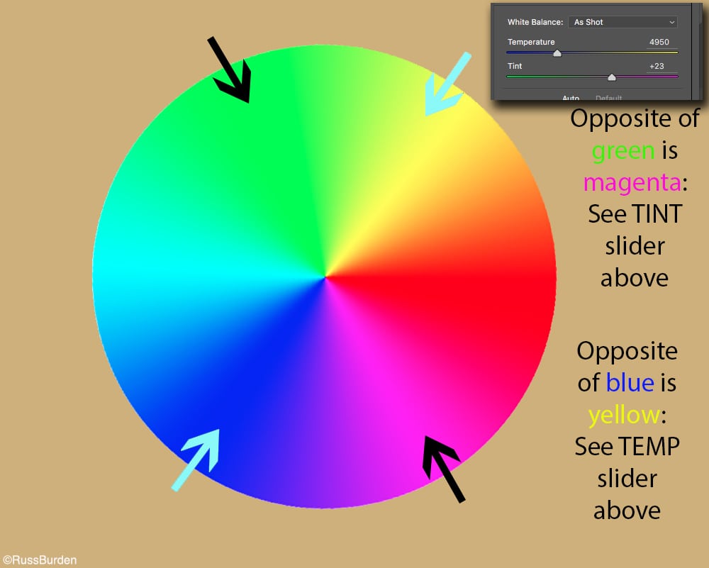
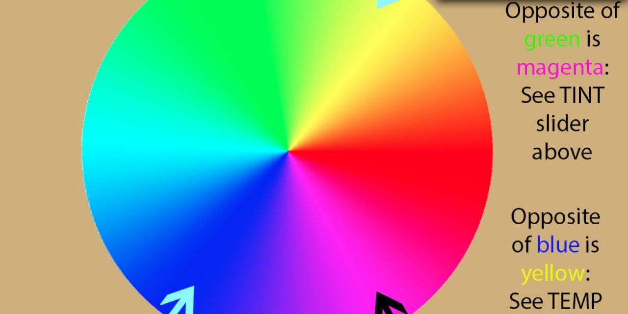
The Color Wheel: Study the diagram of the above color wheel. Note how the Temperature and Tint sliders in Adobe Camera RAW relate to the fact yellow and blue are opposites, as are green and magenta. The sliders are also found in the Develop module for those who use Lightroom. Combining yellow and blue hues in the same image is good to bring warm tones forward and have cool tones recede. That’s why fall foliage against a cool blue sky often has impact. Since green and magenta are opposites, it’s good to include forested mountains with an alpenglow on mountaintops to bring the early or late light forward and have the greens of the forest recede. Opposites are magenta/green, red/cyan and yellow/blue. Opposite sides of the color wheel create opposing hues. Complementary colors are adjacent to the primary hue. For instance, adjacent to red are orange and magenta. They provide color harmony since they’re in the same color family.
Temperature Control: Warm tones live on the right side of a color wheel, while cool tones exist on the left. Warm tones elicit feelings of excitement, love, passion, joy and happiness. Cool tones are soothing and evoke serenity, peacefulness and calmness. Think of it this way—you’re more likely to paint the walls of your bedroom in subtle shades of blue or aqua instead of red, orange or yellow since the bedroom is a place of rest. Images of Caribbean blue water triggers soothing thoughts, while photos of vibrant sunsets generate excitement. Apply these aspects to your photography, and you’ll impact the way viewers perceive your photos.
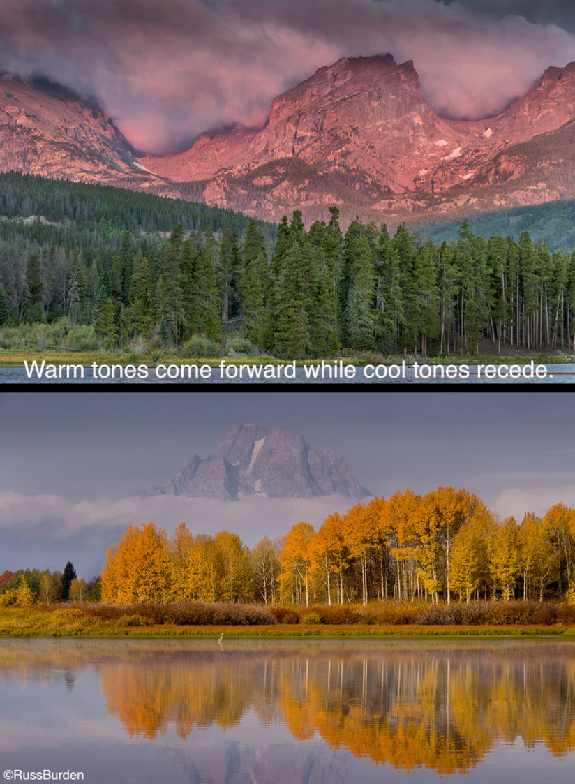
Employ Opposites: As stated above, yellow/blue are opposites, as are green/magenta. The warm tones of each combination come forward while the cool ones recede. In the above scenics, note how your eye first goes to the magenta illuminating the mountain and the yellow of the aspens. The greens and blues become secondary elements and are noticed after seeing the magenta and yellow subjects. As you create future compositions, if you want warm tones to really pop, create compositions where they’re offset against cool ones.
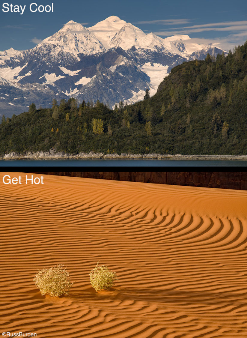
Stay Cool/Get Hot: When opposite colors are included in the same image, impact is created. However, drama in color psychology doesn’t end there. Photos with adjacent colors on the color wheel also provide impact. Images with color that lives on the cool left side of the color wheel and those that live on the warm right side can be stunning. This is known as color harmony. Don’t shy away from subjects that are predominately one color. As a matter of fact, seek this out and find compositions where a touch of warmth is added to a cool-tone image or a touch of cold is added to a warm-tone image. In the photo that represents “Stay Cool,” note how the two very tiny yellow trees in the lower left attract the eye.
Visit www.russburdenphotography.com for information about his nature photography tours and safari to Tanzania.
The post Capture Chromatic Compositions appeared first on Outdoor Photographer.