You’ve invested thousands in your equipment. You’ve braved the outdoors. You’ve spent countless hours learning your craft, learning to develop, learning to organize and learning how to create work that you’re proud of. So now what? Where do you go from here?
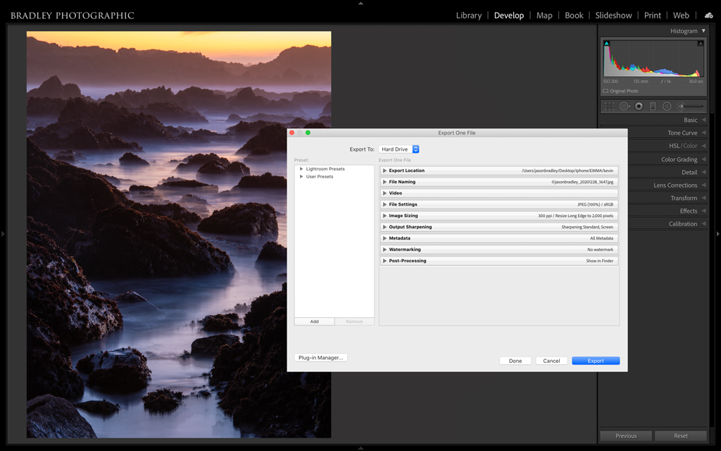
Figure 1. A screenshot of Lightroom Classic’s Export Dialog, the epicenter of this article series.
It’s time for show and tell, ladies and gentlemen. Sharing is caring, and unless you want to be like Emily Dickinson, whose writings didn’t become known until after her demise, you need to start sharing your photos.
The good news is that there are all kinds of ways to share. We have a whole community at our fingertips with a lot of options. There are email, websites, Facebook, Instagram, custom books, prints on metal or canvas, and an almost endless list of other alternative media—all this in addition to your traditional fine art prints to choose from. Sharing your photos has, in some ways, never been easier. However, like all things with modern digital workflow, there are a lot of details to wade through and things to know. My plan is to walk you through as much as I can.
We are going to cover a lot in this four-part article series. I’ll start with the basics in this article. I want to make sure you’re equipped with the knowledge of what your file format choices are, when you should use one color space versus another, and how you should set your image resolution. In this series’ remaining articles, I’ll discuss watermarking, image renaming, resizing, output sharpening, automating your sharing workflow by creating user presets and batch exporting, and even a bit on Lightroom Classic’s Book and Slideshow Modules.
Which File Format Should You Choose When Sharing Your Photos?
One of your biggest decisions as you export your images is what file format to use. The destination is what dictates that choice. Is your export intended for the web and social media, to make fine-art prints, to submit to a contest or send to a client? Each choice has vastly different requirements, and you need to know your file formats in order to choose appropriately.
You probably already know your format basics. Most serious photographers know to shoot RAW with your camera and make JPEGs for the web. But I want you a bit more equipped than that. Fortunately, there really are only a couple things to consider when thinking about export formats. First: Compressed versus uncompressed. Second: File size. Within that framework, Lightroom doesn’t offer you nearly as many options as Photoshop. In Lightroom, you can export a TIFF, PSD, JPEG, PNG, DNG or Original (Figure 2). Breaking these options down further, you have compressed files, uncompressed files and RAW files—the last assuming your “original” version was shot RAW.
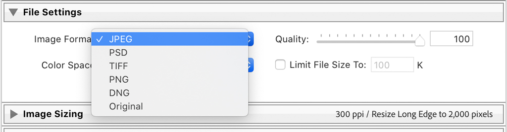
Figure 2. Available file formats that Lightroom offers for exporting.
JPEG and PNG are your compressed formats and are the best choices for sharing your photos online. Compression is used when you need an image’s size to shrink. Smaller-size images load faster on websites and are easier to email. It’s worth noting that anything you upload to social media (and many other online uses) will be compressed whether you initially add a compressed file type or not. In fact, most, if not all, social media sites won’t even allow you to upload a TIFF or a PSD. So, it’s best just to compress your file upfront if it’s intended for the internet.
JPEGs and PNGs offer different kinds of compression. JPEGs are referred to as “lossy,” while PNG uses a lossless compression. Lossless compression means that there is no degradation in quality when compressing the file. On the other hand, lossy compression can create “artifacts,” and if the image is heavily compressed, or if you start with low-resolution files, those artifacts can be noticeable. However, even though lossy compression sounds bad on the surface, I actually suggest JPEGs as your format of choice for sharing your photos on the internet.
There are a couple reasons why I suggest JPEG. Lossy compression is more efficient at shrinking a file’s size, so JPEGs are smaller. Contributing to the difference in size, PNG is also equipped with an extra layer, or alpha channel, that supports transparent backgrounds. If you save a layered image from Photoshop with a transparent background, that background will turn white.
Most importantly, PNGs and lossless compression seem to work best with preserving sharp edges, such as those found in text and areas of clear separation of color like you may see on a corporate logo. Your typical photograph has more tonal complexity, which works better with JPEGs. Admittedly, the difference isn’t huge between the two. But I’m confident that you’ll have more success with the quality of your exports if you stick to JPEG for photographs. Keep your PNG formats for graphics, logos, images with transparent backgrounds and screenshots.
In contrast, TIFF and PSD are uncompressed formats. PSD, or Photoshop Document, is Adobe’s version of an uncompressed format and is smaller in size than a TIFF. My suggestion for which to use depends on your workflow.
If you work a lot with layers in Photoshop, PSD might be your format of choice. However, if you use PSD and are going back and forth between Lightroom and Photoshop, I strongly recommend you follow Adobe’s own instructions in Lightroom’s preferences to “Maximize Compatibility” (Figure 3). Photoshop will ask by default if you want this when saving a PSD.
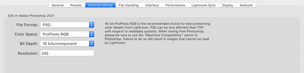
Figure 3. If you choose to use PSDs as your uncompressed format, be aware that they are not as universally accepted as TIFF. Additionally, you’ll want to make sure you are Maximizing Compatibility of your PSDs when saving them, as suggested here in Lightroom’s preferences.
If you’re sending your images off for printing or to a client, and they want a high-resolution uncompressed format, then I suggest TIFF because it’s a more universally accepted format. Oh, and you can save Photoshop layers in TIFF files as well.
One limitation of the PSD is that if you happen to be working with large files of 2GB or more, then PSD isn’t even an option; PSD has a 2GB limit. Adobe did create a PSB format as a solution for this, but as you can see in Figure 3, that format isn’t an option. Of course, you would have to export a gigantic file to make a PSD larger than 2GB. For example, if I exported a file from my Nikon D850 to achieve that size, that file would have to be 50×80 inches at 300 ppi. I suspect most of you don’t make prints that large. Most of you.
DNG and Original are your RAW format choices. Again, this assumes that your “original” is shot RAW. The difference here is that DNG (Digital Negative)—Adobe’s version of a RAW format—will contain any metadata you have added to your file in Lightroom, which includes organizational and developmental metadata. Organizational metadata are things like keywords, captions and star ratings, while developmental metadata is anything you have done to your image in Lightroom’s Develop Module. Your Original is just your untouched RAW file in its native format (NEF, CR2, ARW, etc.). Of course, if you converted that file to a DNG upon import, then your Original is an exported DNG without all your organizational and developmental metadata. Needless to say at this point, if you’re sending someone a RAW file and want them to see all your developments and keywords, use DNG. If you just want them to see your original RAW without that extra information, choose Original.
To sum up: Use TIFF or PSD for your large files intended for print or other large, highly detailed types of reproduction and know that TIFF is more universally accepted. Use JPEG for the web and social media. Choose DNG if you want to share your RAW data with your developments and organizational metadata. If you don’t want to share your developmental or organizational information, export as Original.
Image Resolution & The 72 PPI Myth
I see it all the time: Photographers, photo clubs, photo contests and clients asking for submissions with some predetermined pixel width they desire—followed by a second request to have the resolution (ppi) set to 72. In this context, ppi is irrelevant.
For those of you not in the know, ppi (pixels per inch) can be an important setting when exporting your images. It is found in the Image Sizing panel in the export dialogue. (We’ll examine that dialogue in the next article in this series.) Though ppi and dpi (dots per inch) are essentially the same, ppi is a digital (file) specification, while dpi is a printing specification. Lightroom only offers ppi as your output option.
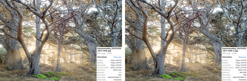
Figure 4. Here are two exports of the same image. Both are exported at 2,000 pixels wide, and one is set to 1 ppi (left) and the other to 800 ppi (right). Both are the same resolution and size, and there is no difference in quality.
Why is ppi irrelevant? This idea is best illustrated with a side-by-side comparison. Figure 4 shows two images that were exported from Lightroom Classic. Both images were exported at 2,000 pixels wide. However, the one on the left was exported with the Resolution set to 1 ppi, while the one on the right was set to 800 ppi. Notice the difference in quality? Notice the difference in file size? No, there is no difference. The reason is because once you define the size of an image in terms of total pixels, a digital criteria, the ppi is determined by the specifications of the screen of your device or computer’s display.
Back in the day, 72 ppi was suggested because most computer screens on the market displayed at that resolution. However, screens today are usually at least 150 ppi, while others can be well over 400 ppi. But again, when defining the size of an image by way of pixel dimensions, ppi doesn’t matter.
When is ppi relevant? It becomes important when you define the size of your image in terms of inches or centimeters—a physical specification. In that context, ppi is critical. In Figure 5, I have two images exported at 4×6 inches. One was set to 25 ppi and the other to 800 ppi. Notice the difference here?
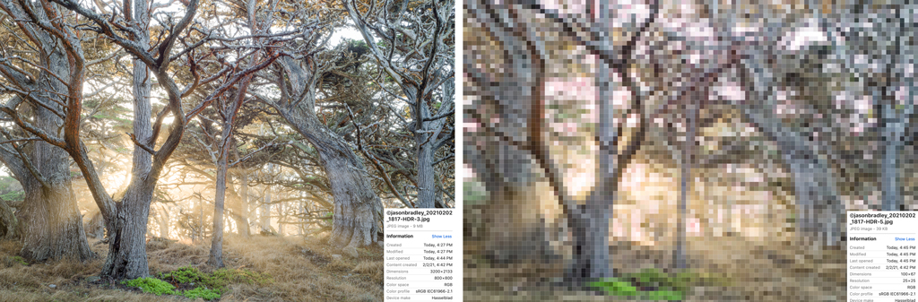
Figure 5. Here are two exports of the same image seen in Figure 4. In this case, we are setting the images to a specific physical size of 4×6 inches at 800 ppi in one (left) and 25 ppi in the other (right). There is a huge difference in quality. When you set the size of your image in terms of inches instead of pixels, ppi is critically important.
So, what should you set your resolution to when working in inches or centimeters? Personally, I almost always resize my images by defining pixels on the long or short edge of an image, as most of my exports are intended for the web or social media. The only time I would suggest that you do differently is when you intend to send an image out for printing where you want to control the upsizing part of the workflow. In this case, it’s often (but not always) better to export the image at the size of your intended print and set your Resolution to 300 ppi. So, if you want to make a 24×36-inch print, then set your file dimensions to 24×36 inches at 300 ppi.
Most printers print at 300 dpi but not all. Many fine-art Epson printers print at 360 dpi. In theory, it’s better if you know the specs of the printer you’re using and set the resolution accordingly, but I’ve tested this and didn’t notice the difference. The print driver will interpolate (make a calculated guess) any missing data to get from 300 dpi to 360 dpi—that’s not a lot of interpolation. So, while it’s best to set ppi to match the printer’s dpi, if you’re close, you should be fine.
Which Color Space Should You Choose When Sharing Your Photos?
Color spaces help us maintain consistency and quality depending on our intended output. Simply put, a color space is a gamut or range of colors that are organized by numerical values. The goal in quantifying colors is to have them reproducible from device to device. There are billions of tonal possibilities, and if a specific shade is not defined this way, it would be chromatic chaos.
Not surprisingly, there are different kinds of spaces. There are large color spaces that define a wide array of colors and small color spaces that contain a more limited range. Speaking generally, there are three common color spaces that photographers typically use: Adobe RGB, sRGB and wide-gamut spaces such as ProPhoto RGB or Display P3. Of course, there are plenty more color space possibilities, but these are popular.
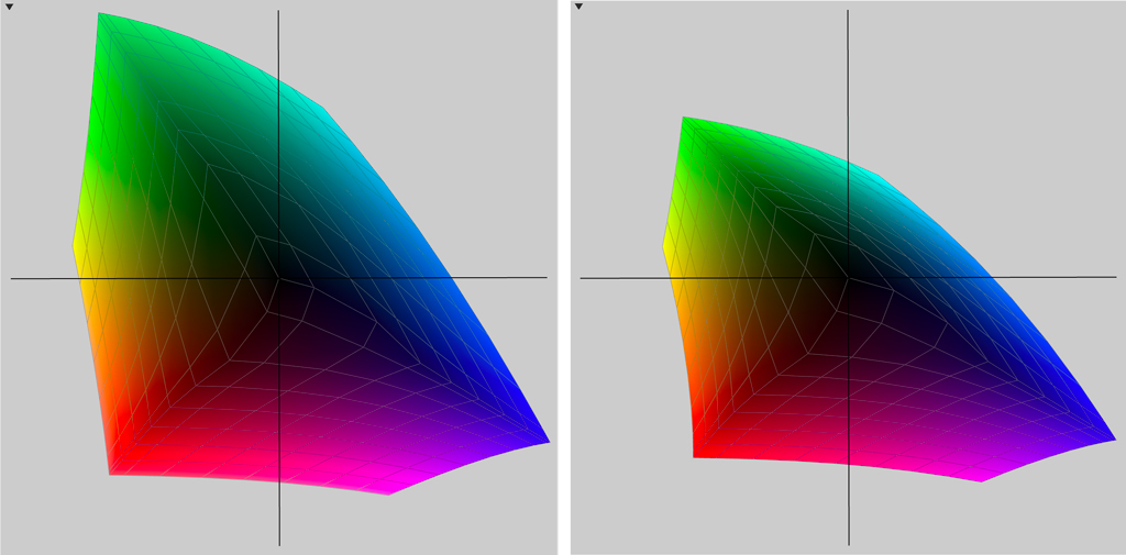
Figure 6. Not all color spaces are created equal. Here is a partial view of an Adobe RGB color space (left) next to an sRGB color space (right). Adobe RGB has a much wider gamut.
Figure 6 illustrates what I mean by “big” and “small” spaces. The smaller graph is sRGB, a space that has a more limited color range, and which I suggest as the best choice when sharing your photos on the internet. The larger graph is Adobe RGB, which I recommend choosing for anything you export that’s intended for print. Larger (wider-gamut) color spaces are also recommended when you export an image that will be worked on further in Photoshop or another software application outside of Lightroom. In general, when editing and developing images, it’s best to use wide-gamut color spaces.
Pro tip: You can’t apply a color space when exporting a DNG or Original RAW file because RAW files by nature have no defined color.
Putting It All Together
Let me condense all of this for you:
- When you export for sharing your photos on the internet, choose JPEG.
- If you have a graphic or logo or an image with a transparent background, use PNG.
- For images you export for print, use TIFF and set your ppi to 300 if you’re defining a physical output dimension like inches.
- If you work a lot with Photoshop layers, use PSD as your uncompressed format, but don’t forget to follow the instructions to change your Photoshop settings, as shown in Figure 3.
- When sharing your photos in their RAW state, export them as a DNG to preserve all of the adjustments you’ve made in Lightroom or as “Original” to omit that extra data.
- Use larger color spaces for photo editing and printing.
- Use the smaller sRGB color space when sharing your photos on the web.
In article two of this series, I’ll begin walking through the Export Dialog step by step. There’s more to consider with a lot of this—don’t hit that Export button just yet—but you now have the basic framework of what choices to make and why.
The post Sharing Your Photos, Part 1 appeared first on Outdoor Photographer.