The color that’s portrayed in a photo has a subconscious impact on the viewer. I don’t want to analyze every hue and their meanings, so I’ll just share a few examples:
Blue: Tranquility, peacefulness and confidence.
Yellow: Warmth, caution and energy.
Green: life, freshness and growth.
Purple: Luxury, passion and wisdom.
Red: Danger, excitement and love.
Black: Power, mystery and horror.
White: Hope, purity and simplicity.
The color that dominates any image you make conveys a message of the above qualities. The more a single color takes up image real estate, the greater the message. This got me thinking about a topic for this week’s tip. What if a photographer was to create the opposite? What if you compose images where just a single color jumps out but the image real estate of the color doesn’t overwhelm the image?
To catch a viewer’s attention, a photo should have a key focal point upon which to rest the eye. The stronger that focal point, the easier it is to discern the message of the image. Hand in hand with this, if the focal point has strong color or contrast, it will be prominent. In most cases, that focal point monopolizes the composition. It’s with this in mind that I challenge every reader to make images that support the topic of this week’s tip. Create an image where a single color grabs the viewer but the ground rule is that the focal point is small.
It may be cliched, but red subjects stand out and work well to command attention. Look for subjects with red as they can easily enhance an image. The surrounding colors shouldn’t be complementary due to their similarities. If there are a lot of yellows and oranges, it doesn’t meet the guideline of the task. Look for adjacent colors to the subject that are on the opposite side of the color wheel. Blues, aquas and greens would be perfect.
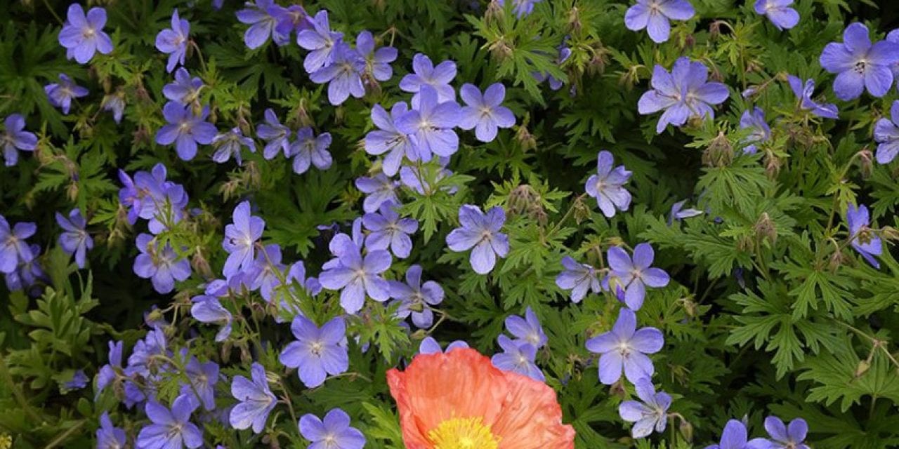
Orange Poppy
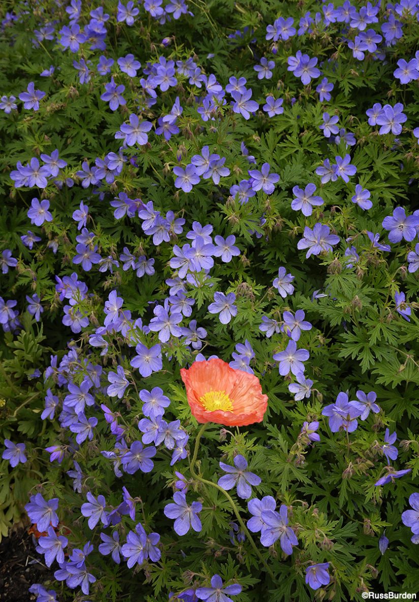
I wandered the flower fields in the high country of Colorado during the peak season in July. Blue flax acts as a ground cover and it was widely spread. As I coursed the perimeter of the beds, the orange poppy stood out like a sore thumb. I used the rule of thirds to place the flower. I intentionally centered it based on the way the flax radiated from the head of the poppy. Everything became a leading line. What makes this image a great example of this week’s tip is twofold: The fact that a solitary poppy decided to take root in the bed of flax, which made it prominent. The second relates to the color wheel where 95 percent of the image is comprised of blue and green and the other 5 percent of orange and yellow are direct opposites.
Green Lichen
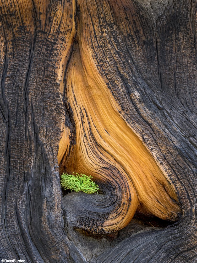
Every August, I lead a nature photo tour to Mount Evans. While not widely known, it’s a photographer’s mecca. Wildlife abounds, the scenery is magnificent, flowers are all over and there’s a bristlecone pine forest that’s unrivaled in the lower 48. I always take my participants into the pine forest on an overcast day and have them make what I call the “intimate landscape.” It’s all about zeroing in on the gnarled patterns of the tree trunks and bark. I spray them with a bit of water to help saturate the warm colors. Upon encountering this one with a spray of lichen, it made the perfect counterpoint to the warm tones of the bark. It’s another example of where a very small portion of the image commands attention.
Fall Color
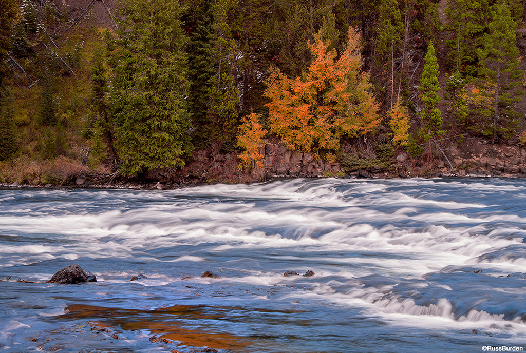
I was driving the roads of Yellowstone in the autumn along the area of the LeHardy Rapids. One section of deciduous trees had begun their autumnal transformation, so I stopped. While walking the road to find a good composition, I noticed one peaceful part of the river. Serendipity! The changing fall color was mirrored in the still water. The eye is drawn to the trees along the bank and then to the small area of the reflection. I’m glad I made the stop!
Rhododendron Blooms
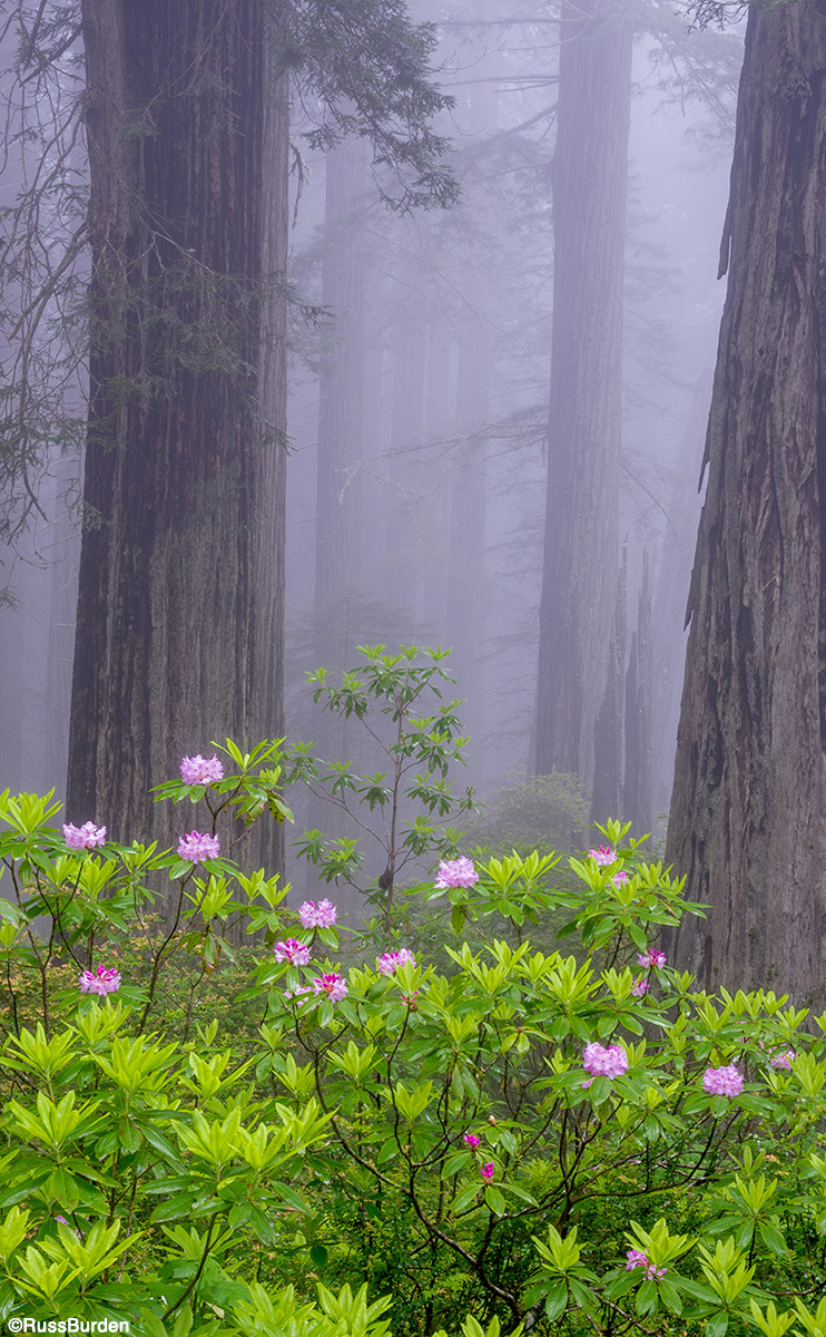
If you love redwood trees, fog, the coast and rhododendrons, be sure you’re along Highway 101 on the California coast in May. The primary place you want to be is the Damnation Creek Trail in the Del Norte Coast Redwood State Park. May is peak season for the rhododendrons to bloom. The bonus is it’s often foggy that time of year. Marry the two and you’re in photography heaven. The soft muted tones created by the fog allows the color of the blooms to stand out. Additionally, the warm tone of pink contrasted against the greens of the rhododendron bushes allow the flowers to stand out. Because pink is a warm color, it grabs the eye of the person examining your image. The fog obscures the background so the massive trunks of the redwoods recede and the flowers come forward.
Rope—Black-and-White Technique

A technique that’s been around for a while is to convert a photo to black and white but leave part of the color intact. The part that remains vivid is the primary subject. All color is removed from every section except the part you want to stand out. I give you the condensed version of how it’s done. There’s info all over the internet that takes you into greater detail.
- Make a duplicate layer of the background.
- Select the portion you want to preserve using the magic wand.
- Inverse the selection.
- Open the photo in Nik Silver Efex and the background area will automatically convert to black and white.
- Click the OK button in the lower right and when you close out of Silver Efex, you’ll see the result.
I encourage you to take the challenge upon yourselves to find images that mimic the technique of this week’s tip. Next thing you know, each time you head into the field it will become part of your repertoire.
Visit www.russburdenphotography.com for information about his nature photography tours and safari to Tanzania.
The post Color Accents appeared first on Outdoor Photographer.